
我做了一个这样的设计
如何用CSS屏蔽背景?
我试过这样的代码
null
.img-poster {
  display: block;
  max-width: 100%;
  -webkit-mask-image: url(https://cdn.pbrd.co/images/GYiCod1.png), url(https://cdn.pbrd.co/images/GYiCQsM.png);
  -webkit-mask-position: bottom center, center center;
  -webkit-mask-repeat: no-repeat, no-repeat;
}

.add {
  -webkit-mask-composite: add;
}
<section class="section poster-container">
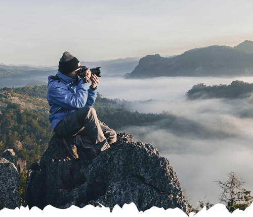
<img src="https://imagejournal.org/wp-content/uploads/bb-plugin/cache/23466317216_b99485ba14_o-panorama.jpg" alt="" class="img-poster add img-responsive">
</section>null
我使用的掩码图像是
https://i.stack.imgur.com/fg2k5.png
https://i.stack.imgur.com/zmylj.png
你们能告诉我我的代码出了什么问题吗?我知道我可以只导入到png,但我尝试使用css
你只需要考虑一个图像,它是你的蒙版的底部部分,然后使用一个简单的渐变为另一部分。您也不需要mask-composite。只需调整大小/位置,使两个掩模不重叠:
null
.img-poster {
  display: block;
  max-width: 100%;
  -webkit-mask:
     linear-gradient(#fff,#fff)              top,
     url(https://i.ibb.co/5WvbqgG/zmylJ.png) bottom;
  -webkit-mask-size:
     100% calc(100% - 30px),
     auto 30px;
  -webkit-mask-repeat: repeat-x;
  mask:
     linear-gradient(#fff,#fff)              top,
     url(https://i.ibb.co/5WvbqgG/zmylJ.png) bottom;
  mask-size:
     100% calc(100% - 30px),
     auto 30px;
  mask-repeat: repeat-x;
}
<section class="section poster-container">
<img src="https://imagejournal.org/wp-content/uploads/bb-plugin/cache/23466317216_b99485ba14_o-panorama.jpg" alt="" class="img-poster add img-responsive">
</section>
SVG+过滤器解决方案
用于在图像中创建锯齿边缘的SVG解决方案不需要使用具有锯齿边缘的图案的光栅图像。因此,这种SVG解决方案可以应用于任何图像,并使其自适应。
考虑使用同一图像创建2次锯齿边缘。滤镜被应用于较低的图像,因此,它变得有点大。原始图像被叠加在上面,因此边缘上的牙齿变得可见。为了让牙齿只留在下缘,我们在侧缘用面罩把不需要的牙齿剪掉。
null
.container {
 width:90vw;
 height:90vh;
 }
<div class="container">
<svg version="1.1" xmlns="http://www.w3.org/2000/svg"
xmlns:xlink="http://www.w3.org/1999/xlink"
viewBox="0 0 1800 900" >
<defs>
<mask id="msk1">
<rect x="100%" y="100%" fill="white" />
<rect x="1700" y="0" width="50" height="900" fill="white" />
</mask>
<filter id="displacementFilter">
<feTurbulence type="turbulence" baseFrequency="0.01 0.01"
numOctaves="2" result="turbulence" seed="1"/>
<feDisplacementMap in2="turbulence" in="SourceGraphic"
scale="65" xChannelSelector="R" xChannelSelector="G" yChannelSelector="B"/>
</filter>
</defs>
<!-- The image is processed by a filter and therefore overall dimensions have increased due to the height of the teeth -->
<image filter="url(#displacementFilter)" xlink:href="https://i.stack.imgur.com/paWbQ.jpg.jpg" width="1700" height="850" />
<rect mask="url(#msk1)" x="1700" y="0" width="50" height="900" fill="white" />
<!-- The same original image, but without filters -->
<image x="0" xlink:href="https://i.stack.imgur.com/paWbQ.jpg.jpg" width="1700" height="850" />
</svg>
</div> 