
我使用vanilla CSS和Flexbox构建了这个navbar,我喜欢它在大屏幕上的表现。徽标在中央,这在桌面上是可以的。
我想标志是在左边的移动。换句话说,我希望在桌面上把徽标放在中间,在手机上放在左边,如下所示:
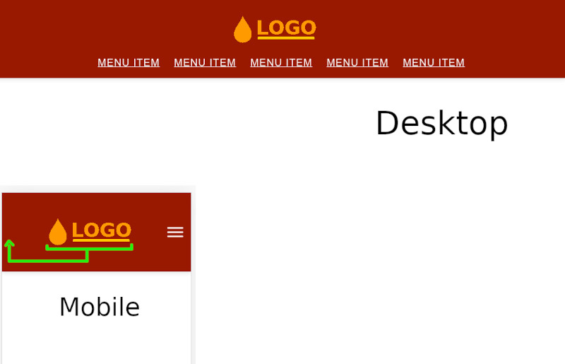
我的版本将徽标放在移动的中心,这不是我想要的:
null
:root {
  box-sizing: border-box;
}

*,
*::before,
*::after {
  box-sizing: inherit;
}

body {
  margin: 0;
  padding: 0;
}

.header {
  position: relative;
  height: 150px;
  width: 100%;
  z-index: 100;
  background: #921801;
  box-shadow: 0 3px 8px rgba(0, 0, 0, 0.1);
  transition: top 0.3s linear 0s;
  display: flex;
  align-items: center;
}

.header-container {
  max-width: 1200px;
  margin: 0 auto;
  display: flex;
  flex-direction: column;
  align-items: center;
  justify-content: center;
}

.header-inner {
  display: flex;
  flex-direction: column;
  align-items: center;
  justify-content: center;
}


.logo img {
  width: 200px;
  height: 57px;
}

.menu-toggle {
  position: absolute;
  right: 10px;
  width: 40px;
  height: 40px;
  top: 50%;
  transform: translateY(-50%);
}

.hamburger {
  position: absolute;
  top: 50%;
  left: 50%;
  transform: translate(-50%, -50%);
}
.hamburger, .hamburger::before, .hamburger::after {
  width: 30px;
  height: 3px;
  background: #fff;
  border-radius: 0.5626em;
  transition: all 0.4s ease-in-out;
}
.hamburger::before, .hamburger::after {
  position: absolute;
  content: "";
}
.hamburger::before {
  top: -8px;
}
.hamburger::after {
  top: 8px;
}

.menu-dropdown {
  position: absolute;
  top: 100%;
  left: 0;
  height: 0;
  width: 100%;
  background: #921801;
  overflow: hidden;
}

.nav-menu {
  list-style: none;
  padding-left: 0;
  margin: 0;
}
.nav-menu li + li {
  margin-top: 0;
  border-top: 1px solid #fff;
}
.nav-menu li > a {
  display: block;
  font-size: 1.2rem;
  padding: 0.8em 0.5em;
  text-transform: uppercase;
  color: #fff;
  letter-spacing: 0.06em;
  font-weight: 500;
  font-family: "Raleway", sans-serif;
  position: relative;
}

@media (min-width: 52em) {
  .header {
    position: fixed;
    top: 0;
  }

  .header-container {
    display: flex;
    flex-direction: column;
  }

  .menu-toggle {
    display: none;
  }

  .menu-dropdown {
    position: initial;
    height: auto !important;
    overflow: initial;
  }

  .logo {
    margin: 25px 0 5px;
  }

  .nav-menu {
    display: flex;
  }
  .nav-menu li > a {
    color: #fff;
  }
  .nav-menu li + li {
    border-top: initial;
    margin-left: 0.5em;
  }
}
<!DOCTYPE html>
<html lang="en">
<head>
<meta charset="UTF-8">
<meta name="viewport" content="width=device-width, initial-scale=1.0">
<link href="header.css" rel="stylesheet">
<title>Header</title>
</head>
<body>
<header class="header">
<div class="header-container">
<!-- Site logo -->
<div class="logo">
<a href="#">
<img src="logo.png" alt="logo">
</a>
</div> <!-- / .logo -->
<!-- Site navigation -->
<nav class="nav">
<div class="menu-toggle">
<div class="hamburger"></div>
</div> <!-- / .menu-toggle -->
<div class="menu-dropdown">
<ul class="nav-menu">
<li><a href="#" class="active">Menu Item</a></li>
<li><a href="#">Menu Item</a></li>
<li><a href="#">Menu Item</a></li>
<li><a href="#">Menu Item</a></li>
<li><a href="#">Menu Item</a></li>
</ul>
</div> <!-- / .menu-dropdown -->
</nav>
</div> <!-- / .header-container -->
</header>
<script src="header.js"></script>
</body>
</html>null
好,对于初学者边距:0自动;display:flex;由于没有设置宽度而相互矛盾,因为它将收缩到最小,而flex无法完成它的工作。因此.header-container应该如下所示:
.header-container {
    max-width: 1200px;
    margin: 0 auto;
    display: flex;
    flex-direction: column;
    align-items: center;
    justify-content: center;
    width: 100%;
}
至于移动上的logo,这将是媒体查询的工作:
@media (max-width: 576px) {
    align-self: flex-start;
}
现在所有人都在一起
null
:root {
  box-sizing: border-box;
}

*,
*::before,
*::after {
  box-sizing: inherit;
}

body {
  margin: 0;
  padding: 0;
}

.header {
  position: relative;
  height: 150px;
  width: 100%;
  z-index: 100;
  background: #921801;
  box-shadow: 0 3px 8px rgba(0, 0, 0, 0.1);
  transition: top 0.3s linear 0s;
  display: flex;
  align-items: center;
}

.header-container {
  max-width: 1200px;
  margin: 0 auto;
  display: flex;
  flex-direction: column;
  align-items: center;
  justify-content: center;
  width: 100%;
}

.header-inner {
  display: flex;
  flex-direction: column;
  align-items: center;
  justify-content: center;
}

@media (max-width: 999999px) {
  .logo{ align-self: flex-start; }
}

.logo img {
  width: 200px;
  height: 57px;
}

.menu-toggle {
  position: absolute;
  right: 10px;
  width: 40px;
  height: 40px;
  top: 50%;
  transform: translateY(-50%);
}

.hamburger {
  position: absolute;
  top: 50%;
  left: 50%;
  transform: translate(-50%, -50%);
}
.hamburger, .hamburger::before, .hamburger::after {
  width: 30px;
  height: 3px;
  background: #fff;
  border-radius: 0.5626em;
  transition: all 0.4s ease-in-out;
}
.hamburger::before, .hamburger::after {
  position: absolute;
  content: "";
}
.hamburger::before {
  top: -8px;
}
.hamburger::after {
  top: 8px;
}

.menu-dropdown {
  position: absolute;
  top: 100%;
  left: 0;
  height: 0;
  width: 100%;
  background: #921801;
  overflow: hidden;
}

.nav-menu {
  list-style: none;
  padding-left: 0;
  margin: 0;
}
.nav-menu li + li {
  margin-top: 0;
  border-top: 1px solid #fff;
}
.nav-menu li > a {
  display: block;
  font-size: 1.2rem;
  padding: 0.8em 0.5em;
  text-transform: uppercase;
  color: #fff;
  letter-spacing: 0.06em;
  font-weight: 500;
  font-family: "Raleway", sans-serif;
  position: relative;
}

@media (min-width: 52em) {
  .header {
    position: fixed;
    top: 0;
  }

  .header-container {
    display: flex;
    flex-direction: column;
  }

  .menu-toggle {
    display: none;
  }

  .menu-dropdown {
    position: initial;
    height: auto !important;
    overflow: initial;
  }

  .logo {
    margin: 25px 0 5px;
  }

  .nav-menu {
    display: flex;
  }
  .nav-menu li > a {
    color: #fff;
  }
  .nav-menu li + li {
    border-top: initial;
    margin-left: 0.5em;
  }
}
<!DOCTYPE html>
<html lang="en">
<head>
<meta charset="UTF-8">
<meta name="viewport" content="width=device-width, initial-scale=1.0">
<link href="header.css" rel="stylesheet">
<title>Header</title>
</head>
<body>
<header class="header">
<div class="header-container">
<!-- Site logo -->
<div class="logo">
<a href="#">
<img src="logo.png" alt="logo">
</a>
</div> <!-- / .logo -->
<!-- Site navigation -->
<nav class="nav">
<div class="menu-toggle">
<div class="hamburger"></div>
</div> <!-- / .menu-toggle -->
<div class="menu-dropdown">
<ul class="nav-menu">
<li><a href="#" class="active">Menu Item</a></li>
<li><a href="#">Menu Item</a></li>
<li><a href="#">Menu Item</a></li>
<li><a href="#">Menu Item</a></li>
<li><a href="#">Menu Item</a></li>
</ul>
</div> <!-- / .menu-dropdown -->
</nav>
</div> <!-- / .header-container -->
</header>
<script src="header.js"></script>
</body>
</html>
您必须使用css媒体查询以移动设备为目标,并为这些设备编写一组不同的规则。
