
我正在用materialui-tabs主题https://material-ui.com/api/Tab/构建一个React16.13.0应用程序。我在组件中创建了这些样式...
const theme = createMuiTheme({
  overrides: {
    MuiTab: {
      root: {
        "&.MuiTab-root": {
          backgroundColor: "black",
          border: 0,
          borderBottom: "2px solid",
          "&:hover": {
            border: 0,
            borderBottom: "2px solid",
          },
        },
        "&.Mui-selected": {
          backgroundColor: "none",
          borderBottom: "2px solid #373985",
          borderColor: "#373985",
        }
      }
    }
  }
});

const useStyles = makeStyles((theme) => ({
  root: {
    width: "100%",
    flexGrow: 1,
    color: "#3739B5",
    backgroundColor: "white",
  },
  viewButtons: {
    marginTop: theme.spacing(2),
    marginBottom: theme.spacing(1),
  },
}));
这些应用于
  <ThemeProvider theme={theme}>
  <AppBar position="static">
    <Tabs
      classes={classes}
      value={value}
      variant="fullWidth"
      centered
      onChange={handleChange}
      aria-label="volunteer dashboard tabs"
    >
      <Tab label={proposedLabel} {...a11yProps(2)} />
      <Tab label={planningLabel} {...a11yProps(1)} />
      <Tab label={inProgressLabel} {...a11yProps(0)} />
      <Tab label={completedLabel} {...a11yProps(3)} />
    </Tabs>
  </AppBar>
  </ThemeProvider>
我正在尝试更改所选选项卡的背景颜色。基于devtools,inspection,类被列为
.PrivateTabIndicator-colorSecondary-267 {

    background-color: #f50057;
}

.PrivateTabIndicator-root-265 {
            width: 100%;

        bottom: 0;

        height: 2px;

        position: absolute;

        transition: all 300ms cubic-bezier(0.4, 0, 0.2, 1) 0ms;
}
然而,尽管我已经列出了在我的主题中,颜色显示为红色,尽管我在我的样式中指定了什么
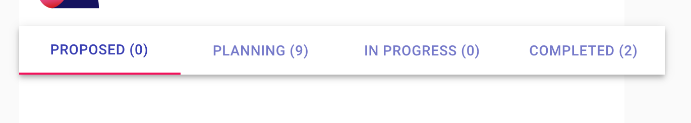
如何覆盖选定选项卡的边框颜色?
你能试试这个解决方案对我有用吗。我假设您想要覆盖底部边框指示器颜色。
    <Tabs value={0} TabIndicatorProps={{ style: { background: "#hex-color" } }}>
         <Tab className={clasess.tab} label="Home" />
         <Tab className={clasess.tab} label="Services" />
    </Tabs>
您现在可以使用TabIndicatorProps使用当前版本的MUI(4.10.02)来设置活动指示器的样式。这里有文件。
有两种方法可以做到这一点:
方法1:使用样式:{}
import React from "react";
import PropTypes from "prop-types";
import { Tabs, Tab, makeStyles } from "@material-ui/core";

const TabsIndicator = () => {
  const [value, setValue] = React.useState(0);

  const handleChange = (event, newValue) => {
    setValue(newValue);
  };

  return (
    <React.Fragment>
       <Tabs
         value={value}
         onChange={handleChange}
         TabIndicatorProps={{
           style: { background: "cyan", height: "10px", top: "35px" }
         }}
       >
         <Tab label="TEST1" value={0} />
         <Tab label="TEST2" value={1} />
         <Tab label="TEST3" value={2} />
         <Tab label="TEST4" value={3} />
       </Tabs>
    </React.Fragment>
  );
};

export default TabsIndicator;
方法2:使用classname:{类}
import React from "react";
import PropTypes from "prop-types";
import { Tabs, Tab, makeStyles } from "@material-ui/core";

const useStyles = makeStyles(theme => ({
  indicator: {
    backgroundColor: "green",
    height: "10px",
    top: "45px"
  }
}));

const TabsIndicator = () => {
  const classes = useStyles();

  const [value, setValue] = React.useState(0);

  const handleChange = (event, newValue) => {
    setValue(newValue);
  };

  return (
    <React.Fragment>
        <Tabs
          value={value}
          onChange={handleChange}
          TabIndicatorProps={{ className: classes.indicator }}
        >
          <Tab label="TEST1" value={0} />
          <Tab label="TEST2" value={1} />
          <Tab label="TEST3" value={2} />
          <Tab label="TEST4" value={3} />
        </Tabs>
    </React.Fragment>
  );
};

export default TabsIndicator;
你也可以在这里看看我的沙箱。希望这有帮助!
