
我有clip-part来制作“切角”效果。
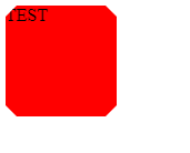
我想将背景更改为白色并使用绿色边框。 问题是,当我将背景改为白色时,边角是空的:
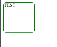
我如何使绿色边框角在悬停?
null
.test {
  background: red;
  width: 100px;
  height: 100px;
  /* CORNERS */
  clip-path: polygon(10px 0%, calc(100% - 10px) 0%, 100% 10px, 100% calc(100% - 10px), calc(100% - 10px) 100%, 10px 100%, 0% calc(100% - 10px), 0% 10px);
}

.test:hover {
  background: white;
  cursor: pointer;
  border: 3px solid green;
}
<div class='test'>Test</div>null
JSFiddle
添加一些渐变以填充缺少的空格:
null
.test {
  background: red;
  width: 100px;
  height: 100px;
  box-sizing:border-box;

  /* CORNERS */
    clip-path: polygon(10px 0%, calc(100% - 10px) 0%, 100% 10px, 100% calc(100% - 10px), calc(100% - 10px) 100%, 10px 100%, 0% calc(100% - 10px), 0% 10px);
}

.test:hover {
  --grad:transparent 49.5%,green 50%;
  background:
    linear-gradient(to top right   ,var(--grad)) top    right,
    linear-gradient(to top left    ,var(--grad)) top    left,
    linear-gradient(to bottom right,var(--grad)) bottom right,
    linear-gradient(to bottom left ,var(--grad)) bottom left,
    white;
  background-size:13px 13px; /* 10px of the clip-path + 3px of border */
  background-repeat:no-repeat;
  background-origin:border-box;
  cursor: pointer;

  border: 3px solid green;
}
<div class='test'>
</div>
为了便于阅读,我将对我的评论做一个回答:
对于infos,如果在2级容器上使用clip-path,则可以使用drop-shadow()筛选器在translucide边缘周围添加阴影。
剪辑路径应用于子项drop-shadow()在父级上下面是jsfiddle演示片段:
null
.test div {
  background: red;
  width: 100px;
  height: 100px;
  /* CORNERS */
  clip-path: polygon(10px 0%, calc(100% - 10px) 0%, 100% 10px, 100% calc(100% - 10px), calc(100% - 10px) 100%, 10px 100%, 0% calc(100% - 10px), 0% 10px);
}

.test:hover {
  filter: drop-shadow(0px 3px 0px green) drop-shadow(3px 0px 0px green) drop-shadow(-3px 0px 0px green) drop-shadow(0px -3px 0px green);
  /* made 1 for each sides */
}

.test:hover div {
  background: white;
  cursor: pointer;
}

.test {
  width: max-content;
}

.test div {
  /* demo purpose */
  display: flex;
  align-items: center;
  justify-content: center;
  flex-direction: column;
}
<div class='test'>
<div>
TEST
</div>
</div>
据我所知,用剪辑路径在元素周围创建边框是不可能的。 此方法使用内部和外部元素。 来源:https://codepen.io/bennettfeely/pen/azjwwx/
.outside {
  position: relative;
    width: 70vmin;
    height: 70vmin;
    background: red;
    -webkit-clip-path: polygon(50% 0%, 83% 12%, 100% 43%, 94% 78%, 68% 100%, 32% 100%, 6% 78%, 0% 43%, 17% 12%);
clip-path: polygon(50% 0%, 83% 12%, 100% 43%, 94% 78%, 68% 100%, 32% 100%, 6% 78%, 0% 43%, 17% 12%);
}

.inside {
  position: absolute;
  top: 5px;
  left: 5px;
  right: 5px;
  bottom: 5px;
  background: red;
  -webkit-clip-path: polygon(50% 0%, 83% 12%, 100% 43%, 94% 78%, 68% 100%, 32% 100%, 6% 78%, 0% 43%, 17% 12%);
  clip-path: polygon(50% 0%, 83% 12%, 100% 43%, 94% 78%, 68% 100%, 32% 100%, 6% 78%, 0% 43%, 17% 12%);
}

.inside:hover {
  background: white;
  transition: all .2s;
}

.outside:hover {
  background: green;
  transition: all .2s;
}

/* Center the demo */
html, body { height: 100%; }
body {
    display: flex;
    justify-content: center;
    align-items: center;
  background: papayawhip;
}
<div class="outside">
<div class="inside"></div>
</div>