
我找不到如何把盒子放在中间,而是把它向左对齐。看来ul的宽度不适合内容,不能自动设置,只能手动设置。但我不想手动设置,因为我的内容是动态变化的。所以我需要方框居中,但没有手动更改,没有脚本左对齐。
null
div {
  padding: 20px;
  width: 200px;
  background-color: green;
  text-align: center;
}

ul {
  list-style:none;
  padding: 0;
  margin: 0;
  text-align: left;
}

ul li {
  width: 40px;
  height: 40px;
  background-color: wheat;
  display: inline-block
}
<html>
<head></head>
<body>
<div>
<ul>
<li></li>
<li></li>
<li></li>
<li></li>
<li></li>
<li></li>
<li></li>
<li></li>
<li></li>
</ul>
</div>
</body>
</html>null
CSS网格可以做到这一点。调整div的大小以查看结果:
null
div {
  padding: 20px;
  width: 200px;
  border: 1px solid;
  overflow: hidden;
  resize: horizontal;
}

ul {
  list-style: none;
  padding: 0;
  margin: 0;
  display: grid;
  grid-template-columns: repeat(auto-fit, 40px);
  grid-auto-rows: 40px;
  grid-gap: 4px;
  justify-content: center; /* this will do the magic */
}

ul li {
  background-color: wheat;
}
<div>
<ul>
<li></li>
<li></li>
<li></li>
<li></li>
<li></li>
<li></li>
<li></li>
<li></li>
<li></li>
</ul>
</div>
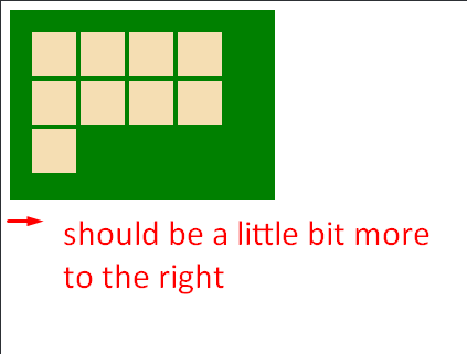
在ul中使用display:flex和flex-wrap:wrap,无需在li中使用inline-block或text-align:center/left
null
div {
  padding: 20px;
  width: 200px;
  background-color: green;
}

ul {
  list-style: none;
  padding: 0;
  margin: 0;
  display: flex;
  flex-wrap: wrap
}

li {
  margin: 5px;
  width: 40px;
  height: 40px;
  background-color: wheat;
}
<div>
<ul>
<li></li>
<li></li>
<li></li>
<li></li>
<li></li>
<li></li>
<li></li>
<li></li>
<li></li>
</ul>
</div>