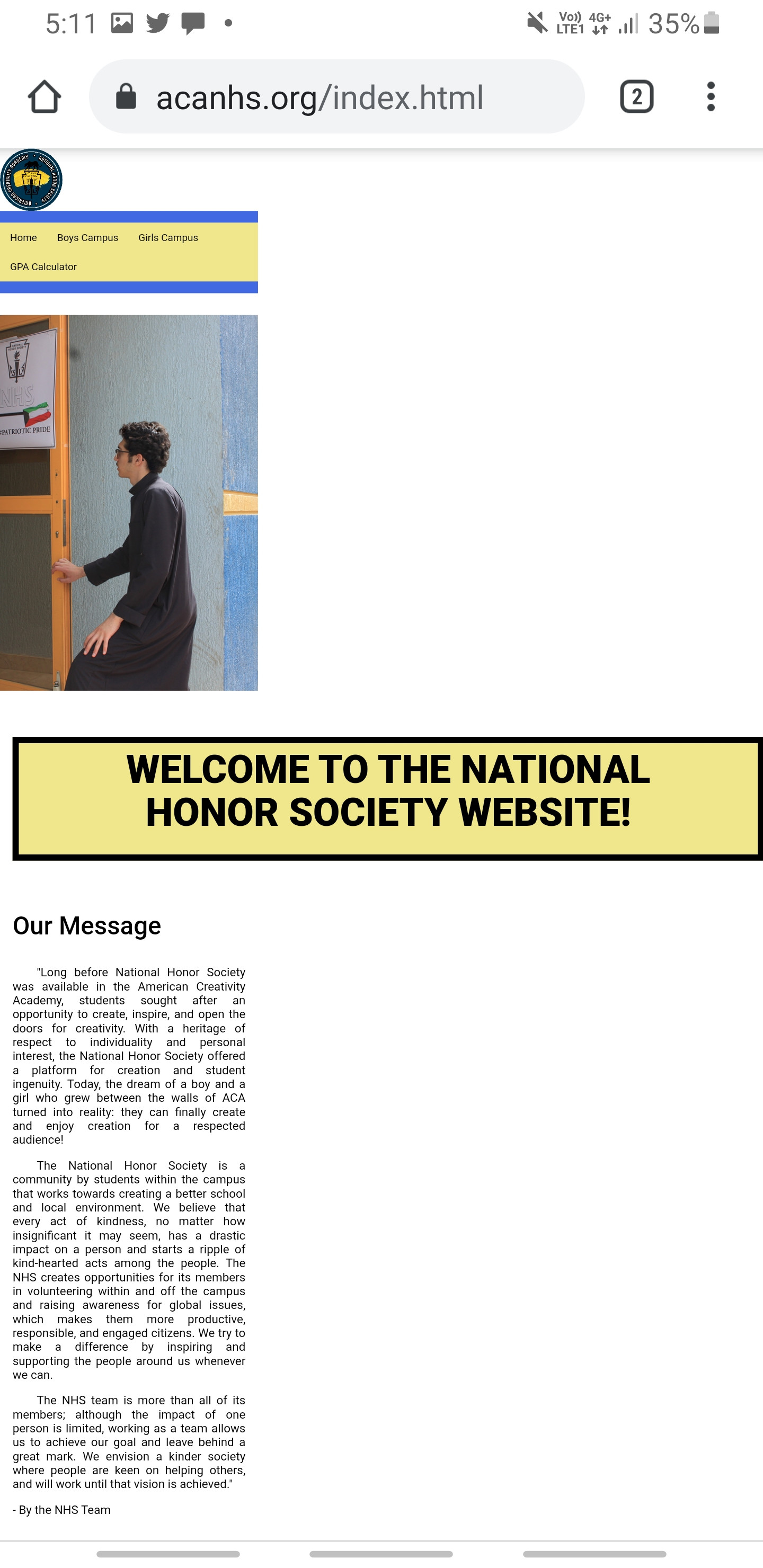


文本框标题占据了大部分空间。我该怎么做才能解决这个问题?
这是我的HTML:
<body>
<script src="https://code.jquery.com/jquery-3.5.1.slim.min.js" integrity="sha384-DfXdz2htPH0lsSSs5nCTpuj/zy4C+OGpamoFVy38MVBnE+IbbVYUew+OrCXaRkfj" crossorigin="anonymous"></script>
<script src="https://cdn.jsdelivr.net/npm/popper.js@1.16.1/dist/umd/popper.min.js" integrity="sha384-9/reFTGAW83EW2RDu2S0VKaIzap3H66lZH81PoYlFhbGU+6BZp6G7niu735Sk7lN" crossorigin="anonymous"></script>
<script src="https://stackpath.bootstrapcdn.com/bootstrap/4.5.2/js/bootstrap.min.js" integrity="sha384-B4gt1jrGC7Jh4AgTPSdUtOBvfO8shuf57BaghqFfPlYxofvL8/KUEfYiJOMMV+rV" crossorigin="anonymous"></script>
<img src="logo.png" width="100" height="100" alt="HTML tag">
<p class="bluebackground"> </p>
<nav>
<ul class="nav">
<li class="navlist"><a class="active" href="index.html">Home</a></li>
<li class="navlist"><a class="active" href="boyshome.html">Boys Campus</a></li>
<li class="navlist"><a class="active" href="girlshome.html">Girls Campus</a></li>
<li class="navlist"><a class="active" href="calculator.html">GPA Calculator</a></li>
</ul>
</nav>
<p class="bluebackground"> </p>
<br>
<div class="w3-content w3-section responsive">
<div class="mySlides w3-animate-top responsive" style="--background-image: url('homepagepictures/81463156_472179973704673_8295529433598935850_n(1).jpg')" >
</div>
<div class="mySlides w3-animate-bottom responsive" style="--background-image: url('homepagepictures/097f1e08-ebfe-434a-bc68-8020d02cee6e.JPG')">
</div>
<div class="mySlides w3-animate-top responsive" style="--background-image: url('homepagepictures/8291878a-b5ad-4003-8cc6-de7baafd84a0.JPG')">
</div>
<div class="mySlides w3-animate-bottom responsive" style="--background-image: url('homepagepictures/27890996_211176766129569_6923967286697000960_n.jpg')">
</div>
<div class="mySlides w3-animate-top responsive" style="--background-image: url('homepagepictures/42914143_364663130939605_1259772328364992140_n.jpg')">
</div>
<div class="mySlides w3-animate-bottom responsive" style="--background-image: url('homepagepictures/42947322_373232869884042_7326776160519321694_n.jpg')">
</div>
<div class="mySlides w3-animate-top responsive" style="--background-image: url('homepagepictures/44689929_944494762409958_8911408401400786089_n.jpg')">
</div>
<div class="mySlides w3-animate-bottom responsive" style="--background-image: url('homepagepictures/fd2b6c09-19b7-42ad-b7fb-bce6dc983690.JPG')">
</div>
<div class="mySlides w3-animate-top responsive" style="--background-image: url('homepagepictures/IMG_6922.jpg')">
</div>
<div class="mySlides w3-animate-bottom responsive" style="--background-image: url('homepagepictures/IMG_6932.jpg')" >
</div>
</div>
<br>
<br>
<script src="slideshow.js"></script>
<style>.sameborder
{
background-color:#F0E68C;
width: 1200px;
border: 10px solid;
padding: 20px;
margin: 20px;
}</style>
<center>
<div class="sameborder">
<h1 class="Welcome responsive">Welcome To The National </h1>
<h1 class="Welcome responsive">Honor Society Website!</h1>
</div>
</header>
<br>
</center>
<h3 class="message" style="margin-left: 20px;">Our Message</h3>
<h3 id="messagetext" align="justify" class="wiki-content">  "Long before National Honor Society was available in the American Creativity Academy, students sought after an opportunity to create, inspire, and open the doors for creativity. With a heritage of respect to individuality and personal interest, the National Honor Society offered a platform for creation and student ingenuity. Today, the dream of a boy and a girl who grew between the walls of ACA turned into reality: they can finally create and enjoy creation for a respected audience!</h3>
<h3 id="messagetext" align="justify" class="wiki-content">  The National Honor Society is a community by students within the campus that works towards creating a better school and local environment. We believe that every act of kindness, no matter how insignificant it may seem, has a drastic impact on a person and starts a ripple of kind-hearted acts among the people. The NHS creates opportunities for its members in volunteering within and off the campus and raising awareness for global issues, which makes them more productive, responsible, and engaged citizens. We try to make a difference by inspiring and supporting the people around us whenever we can.</h3>
<h3 id="messagetext" align="justify" class="wiki-content">  The NHS team is more than all of its members; although the impact of one person is limited, working as a team allows us to achieve our goal and leave behind a great mark. We envision a kinder society where people are keen on helping others, and will work until that vision is achieved."</p>
<h3 id="messagetext" align="justify" class="wiki-content">- By the NHS Team</h3>
怎么做才能让页眉适合屏幕,又不强制用户缩小查看文字呢。。。。。。。。。。。。。。。。。。。
将.SameBorder宽度设置为1200px似乎是导致此问题的原因。一个建议将它改为一个百分比(也许宽度:80%)。
只需在CSS中添加以下内容:
.same border h1{

font-size: 2vh; /* Can change value as per your choice..  */

/*  That's It! */

}
我想那行得通。。。
你没有精确,但我猜问题不是真的文本的大小,而更像是你标题的宽度。所以我建议你们这样管理:
中心添加类以设置宽度:100%;在其上SameBorder: .sameborder-container{
width: 100%;
}
.sameborder{
background-color:#F0E68C;
max-width: 1200px;
width: 100%;
border: 10px solid;
padding: 20px;
margin: auto;
box-sizing: border-box;
font-size: 2vw;
}
null
body{
margin:0;
}
    .sameborder-container{
      width: 100%;
    }
    .sameborder{
      background-color:#F0E68C;
      max-width: 1200px;
      width: 100%;
      border: 10px solid;
      padding: 20px;
      margin: auto;
      box-sizing: border-box;
      font-size: 2vw;
}<body>
<script src="https://code.jquery.com/jquery-3.5.1.slim.min.js" integrity="sha384-DfXdz2htPH0lsSSs5nCTpuj/zy4C+OGpamoFVy38MVBnE+IbbVYUew+OrCXaRkfj" crossorigin="anonymous"></script>
<script src="https://cdn.jsdelivr.net/npm/popper.js@1.16.1/dist/umd/popper.min.js" integrity="sha384-9/reFTGAW83EW2RDu2S0VKaIzap3H66lZH81PoYlFhbGU+6BZp6G7niu735Sk7lN" crossorigin="anonymous"></script>
<script src="https://stackpath.bootstrapcdn.com/bootstrap/4.5.2/js/bootstrap.min.js" integrity="sha384-B4gt1jrGC7Jh4AgTPSdUtOBvfO8shuf57BaghqFfPlYxofvL8/KUEfYiJOMMV+rV" crossorigin="anonymous"></script>
<img src="logo.png" width="100" height="100" alt="HTML tag">
<p class="bluebackground"> </p>
<nav>
<ul class="nav">
<li class="navlist"><a class="active" href="index.html">Home</a></li>
<li class="navlist"><a class="active" href="boyshome.html">Boys Campus</a></li>
<li class="navlist"><a class="active" href="girlshome.html">Girls Campus</a></li>
<li class="navlist"><a class="active" href="calculator.html">GPA Calculator</a></li>
</ul>
</nav>
<p class="bluebackground"> </p>
<br>
<div class="w3-content w3-section responsive">
<div class="mySlides w3-animate-top responsive" style="--background-image: url('homepagepictures/81463156_472179973704673_8295529433598935850_n(1).jpg')" >
</div>
<div class="mySlides w3-animate-bottom responsive" style="--background-image: url('homepagepictures/097f1e08-ebfe-434a-bc68-8020d02cee6e.JPG')">
</div>
<div class="mySlides w3-animate-top responsive" style="--background-image: url('homepagepictures/8291878a-b5ad-4003-8cc6-de7baafd84a0.JPG')">
</div>
<div class="mySlides w3-animate-bottom responsive" style="--background-image: url('homepagepictures/27890996_211176766129569_6923967286697000960_n.jpg')">
</div>
<div class="mySlides w3-animate-top responsive" style="--background-image: url('homepagepictures/42914143_364663130939605_1259772328364992140_n.jpg')">
</div>
<div class="mySlides w3-animate-bottom responsive" style="--background-image: url('homepagepictures/42947322_373232869884042_7326776160519321694_n.jpg')">
</div>
<div class="mySlides w3-animate-top responsive" style="--background-image: url('homepagepictures/44689929_944494762409958_8911408401400786089_n.jpg')">
</div>
<div class="mySlides w3-animate-bottom responsive" style="--background-image: url('homepagepictures/fd2b6c09-19b7-42ad-b7fb-bce6dc983690.JPG')">
</div>
<div class="mySlides w3-animate-top responsive" style="--background-image: url('homepagepictures/IMG_6922.jpg')">
</div>
<div class="mySlides w3-animate-bottom responsive" style="--background-image: url('homepagepictures/IMG_6932.jpg')" >
</div>
</div>
<br>
<br>
<script src="slideshow.js"></script>
<center class="sameborder-container">
<div class="sameborder">
<h1 class="Welcome responsive">Welcome To The National </h1>
<h1 class="Welcome responsive">Honor Society Website!</h1>
</div>
<!--</header>-->
<br>
</center>
<h3 class="message" style="margin-left: 20px;">Our Message</h3>
<h3 id="messagetext" align="justify" class="wiki-content">  "Long before National Honor Society was available in the American Creativity Academy, students sought after an opportunity to create, inspire, and open the doors for creativity. With a heritage of respect to individuality and personal interest, the National Honor Society offered a platform for creation and student ingenuity. Today, the dream of a boy and a girl who grew between the walls of ACA turned into reality: they can finally create and enjoy creation for a respected audience!</h3>
<h3 id="messagetext" align="justify" class="wiki-content">  The National Honor Society is a community by students within the campus that works towards creating a better school and local environment. We believe that every act of kindness, no matter how insignificant it may seem, has a drastic impact on a person and starts a ripple of kind-hearted acts among the people. The NHS creates opportunities for its members in volunteering within and off the campus and raising awareness for global issues, which makes them more productive, responsible, and engaged citizens. We try to make a difference by inspiring and supporting the people around us whenever we can.</h3>
<h3 id="messagetext" align="justify" class="wiki-content">  The NHS team is more than all of its members; although the impact of one person is limited, working as a team allows us to achieve our goal and leave behind a great mark. We envision a kinder society where people are keen on helping others, and will work until that vision is achieved."</p>
<h3 id="messagetext" align="justify" class="wiki-content">- By the NHS Team</h3>