
我已经尝试设置display:inline,但运气不好,我已经确保类名不会意外地在项目的其他地方重复,并且我已经尝试调整margin,使左右边距为零,但是什么都不起作用。下面是我的CSS:
null
.wrapper {
  background-color: rgb(232, 234, 246);
  padding: 6vh 0vh 4vh;
}

.container {
  width: 80vh;
  margin: 4vh auto 4vh;
  padding: 2vh 5vh 2vh;

  border: 1px solid gray;
  border-radius: 2rem;
}

.bio-pic {
  float: left;
  margin: 2vh 2vh 1vh;
  height: 30vh;
  border-radius: 2rem;
}

.container h2 {
  margin-top: 2vh;
}

.container p {
  margin-left: 2vh;
}
const Bio = () => {
return (
<div className='wrapper'>
<div className='container' id='about'>
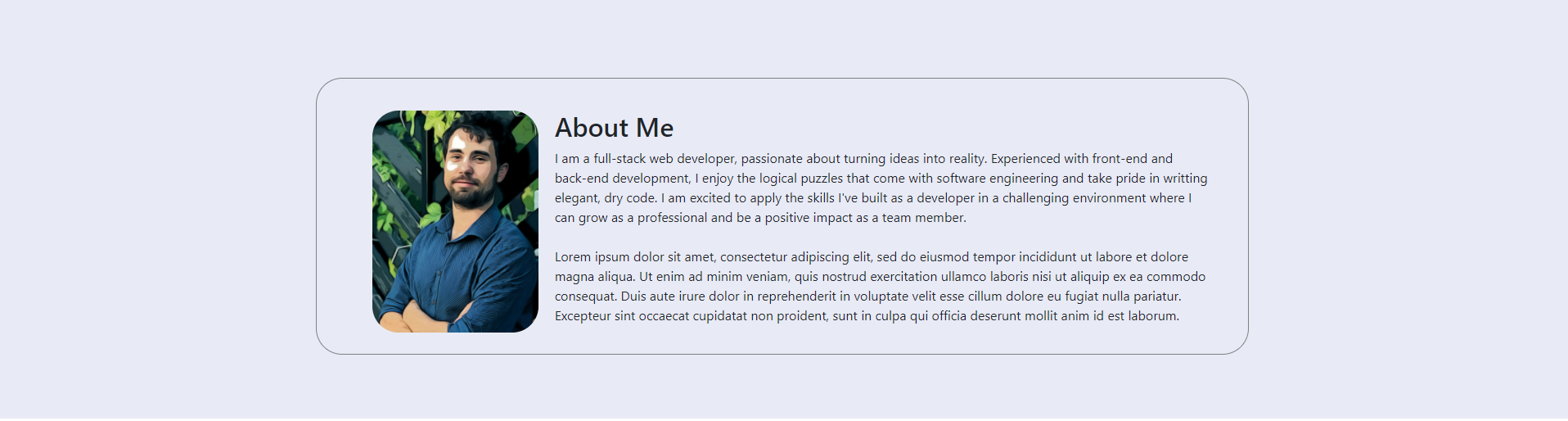
<Image className='bio-pic' src={profile} alt='casey' />
<h2>About Me</h2>
<p>
I am a full-stack web developer, passionate about turning ideas into
reality. Experienced with front-end and back-end development, I enjoy
the logical puzzles that come with software engineering and take pride
in writting elegant, dry code. I am excited to apply the skills I've
built as a developer in a challenging environment where I can grow as
a professional and be a positive impact as a team member.
<br />
<br /> Lorem ipsum dolor sit amet, consectetur adipiscing elit, sed do
eiusmod tempor incididunt ut labore et dolore magna aliqua. Ut enim ad
minim veniam, quis nostrud exercitation ullamco laboris nisi ut
aliquip ex ea commodo consequat. Duis aute irure dolor in
reprehenderit in voluptate velit esse cillum dolore eu fugiat nulla
pariatur. Excepteur sint occaecat cupidatat non proident, sunt in
culpa qui officia deserunt mollit anim id est laborum.
</p>
</div>
</div>
);
};null
您试图以VH(视口高度)为单位给出宽度。因此,当屏幕宽度改变时,容器的宽度不会改变,因为它取决于屏幕的高度。
尝试将vh更改为vw(视口宽度),如下所示:-
.container {
  width: 80vw;
  margin: 4vh auto 4vh;
  padding: 2vh 5vh 2vh;

  border: 1px solid gray;
  border-radius: 2rem;
}
附注:-
我只想提一下,您正在CSS中的许多地方使用VH来设置Margins和Paddings。我认为您应该使用ems。
错误在您的容器中。您设置了VH(视区高度)单位,而不是VW(视区宽度):
.container {
  width: 80vw; /*** HERE was vh instead of vw ***/
  margin: 4vh auto 4vh;
  padding: 2vh 5vh 2vh;

  border: 1px solid gray;
  border-radius: 2rem;
}
我还说,几乎所有你用vh设置填充,边距等的地方,你可能想要设置vw来代替。
我将classname更改为class,以使代码片段能够用于演示。
null
.wrapper {
  background-color: rgb(232, 234, 246);
  padding: 6vh 0vh 4vh;
}

.container {
  width: 80vw; /*** HERE was vh instead of vw ***/
  margin: 4vh auto 4vh;
  padding: 2vh 5vh 2vh;

  border: 1px solid gray;
  border-radius: 2rem;
}

.bio-pic {
  float: left;
  margin: 2vh 2vh 1vh;
  height: 30vh;
  border-radius: 2rem;
}

.container h2 {
  margin-top: 2vh;
}

.container p {
  margin-left: 2vh;
}
<div class='wrapper'>
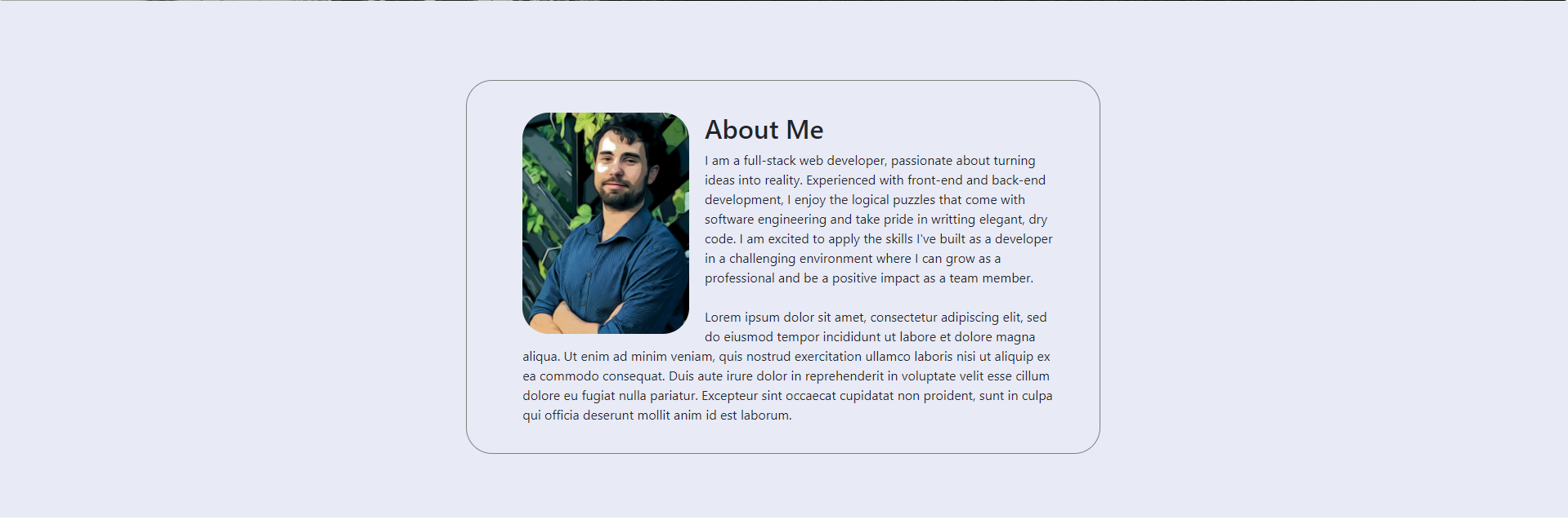
<div class='container' id='about'>
<Image class='bio-pic' src={profile} alt='casey' />
<h2>About Me</h2>
<p>
I am a full-stack web developer, passionate about turning ideas into
reality. Experienced with front-end and back-end development, I enjoy
the logical puzzles that come with software engineering and take pride
in writting elegant, dry code. I am excited to apply the skills I've
built as a developer in a challenging environment where I can grow as
a professional and be a positive impact as a team member.
<br />
<br /> Lorem ipsum dolor sit amet, consectetur adipiscing elit, sed do
eiusmod tempor incididunt ut labore et dolore magna aliqua. Ut enim ad
minim veniam, quis nostrud exercitation ullamco laboris nisi ut
aliquip ex ea commodo consequat. Duis aute irure dolor in
reprehenderit in voluptate velit esse cillum dolore eu fugiat nulla
pariatur. Excepteur sint occaecat cupidatat non proident, sunt in
culpa qui officia deserunt mollit anim id est laborum.
</p>
</div>
</div>