
null
labels = ['JAN', 'FEB', 'MAR', 'APR', 'MAY', 'JUN', 'JUL', 'AUG', 'SEP', 'OCT', 'NOV', 'DEC'];
  chartData = [
    {
      label: 'Doctors',
      data: [10, 20, 30, 40, 50, 40, 30, 20, 10, 20, 30, 40],
      backgroundColor: 'rgb(81, 193, 190)',
    },
    {
      label: 'Clinics',
      data: [20, 30, 40, 50, 40, 30, 20, 10, 20, 30, 40, 50],
      backgroundColor: 'rgb(46, 135, 203)',
    },
    {
      label: 'Hospitals',
      data: [30, 40, 50, 40, 30, 20, 10, 20, 30, 40, 50, 40],
      backgroundColor: 'rgb(209, 174, 200)',
    },
    {
      label: 'Pathology/Diagnosis',
      data: [40, 50, 40, 30, 20, 10, 20, 30, 40, 50, 40, 30],
      backgroundColor: 'rgb(103, 48, 121)',
    }
  ];

ngOnInit() {
    this.showChart();
}

showChart() {
    //var ctx = document.getElementById('barCanvas');
    const canvas = <HTMLCanvasElement> document.getElementById('barCanvas');
    const ctx = canvas.getContext('2d');
    this.barChart = new Chart(ctx, {

      type: 'bar',
      data: {
        labels: this.labels,
        datasets: this.chartData
      },
      options: {
        responsive: true,
        //maintainAspectRatio: false
      }
    });

    this.barChart.reDraw();
  }
.flex-container {
display: flex;
flex-direction: column;
background-color: #ff80bf;
flex-wrap: wrap;
}
.child-div {
background-color: #6600cc;
width: 100px;
margin: 10px;
text-align: center;
padding-top: 20px;
padding-bottom: 20px;
font-size: 30px;
}
.chart-container {
position: relative !important;
width: 100%;
height: 100%;
// display: block !important;
canvas {
width: 100% !important;
max-width: 800px;
height: auto !important;
}
}
.row {
display: block;
// border: 1px solid red;
}
.col-12{
display: inline-block;
width: 100%;
}
.col-9{
display: inline-block;
width: 75%;
}
.col-3{
display: inline-block;
width: 25%;
}
.p1{
padding: 1em 1em;
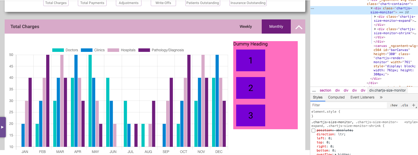
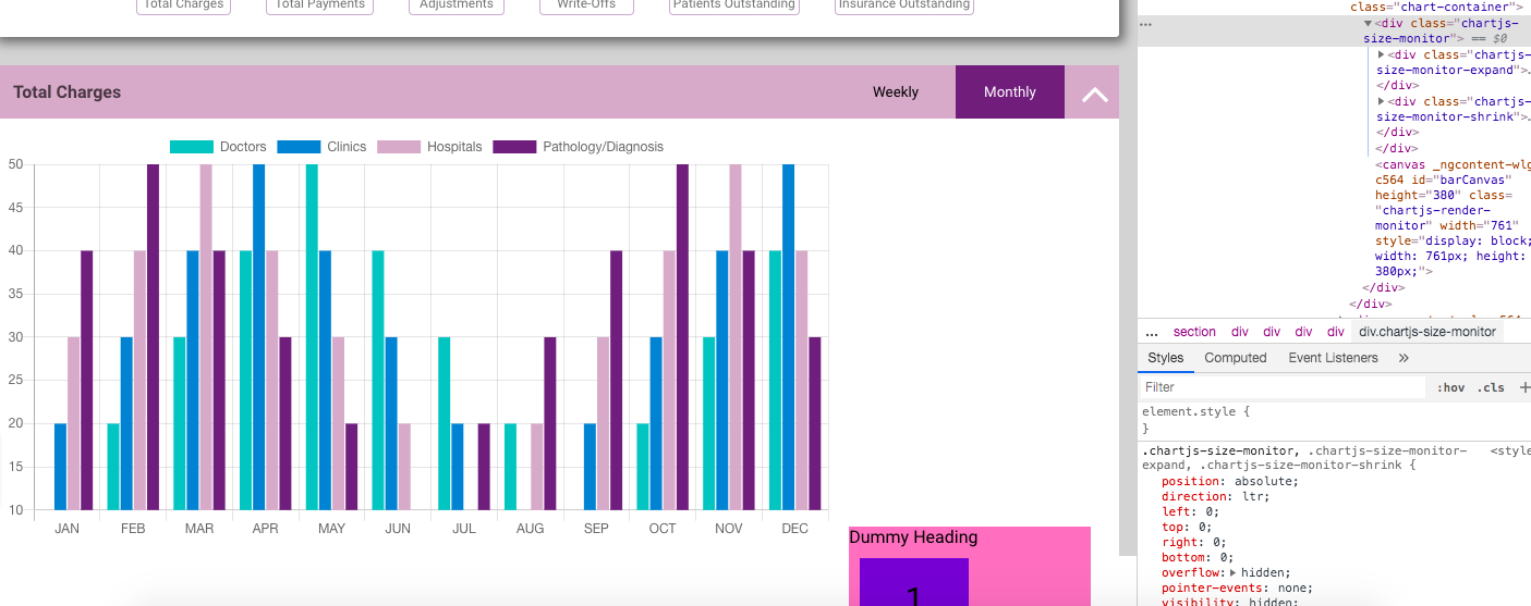
}<div class='row'>
<div class='col-9'>
<div class="chart-container">
<canvas id="barCanvas"></canvas>
</div>
</div>
<div class='col-3 p1'>
<div>
<div class="flex-container">
<div class="title">Dummy Heading</div>
<div class="child-div">1</div>
<div class="child-div">2</div>
<div class="child-div">3</div>
</div>
</div>
</div>
</div>null
我试图使用chart.js添加一个图表,并在一行的2列中添加一些相关数据。我以编程方式实现了一个条形图,正如他们在这里的官方文档中提到的那样。我制作了一个类“行”和两列,宽度分别为75%和25%。我想用图表填充75%的列,用一些数据填充其余的25%。但是div(如第一张图片中所示的粉红色,带1,2,3编号框)与图表的高度相同。相反,它出现在图表的下面,如第二张图所示。我找到了这个问题。根据官方文档,图表画布的父div应该具有相对位置,我就是这样做的。但是chart.js库添加了一个类名为chartjs-size-monitor的动态div作为画布的父div。此div的样式位置为绝对,这导致我的右侧数据div下移。如果取消选中该位置样式,那么div将向上移动,如图1所示。有人能帮我解决这个问题吗?谢了。
这些是我能建议的第一个解决方案。但我不是前端开发人员!我认为会有更好的解决办法。